
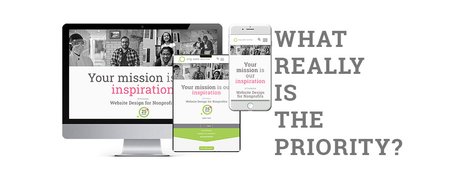
Mobile versus Desktop Screen Size Priority
Is it best to develop your website with the mobile user as the priority?
There’s a very strong argument for going mobile-first, primarily because first-time mobile users outpace desktop users. It’s hard to beat the convenience of a handheld device, coupled with idle time that lends itself to web surfing. However, the strength of that mobile-first argument weakens considerably when you factor in the audience segment and the amount of time invested in the visit.
Considering the visitor.
Is the visitor there to buy a personal item? Or is he or she seeking quality content to make an informed decision about a donation or a vital subject? A smaller device doesn’t just mean easier access to a website; it also means a more pared-down experience and fewer options.
Athough nonprofit website visitors tend to use mobile devices slightly more frequently than desktop devices, the time they spend on desktop often significantly exceeds the time spent on mobile. Desktop users stay longer per session, view more pages, and complete the vast majority of major actions, such as conducting research and making large donations.
Therefore, creating a “mobile-first” web presence for a nonprofit organization must take into account the realities reflected in nonprofit user data. Rather than designing primarily for mobile and treating desktop as secondary, the desktop experience should be developed first—arguably allowing for a more robust presentation of content and options—while ensuring an equally engaging and effective mobile experience.
To Know:
- Between 52% and 57 % of nonprofit website traffic comes from mobile devices, yet generates only 25% of donations. The average desktop user gift is $119. [source] [source]
- According to Semrush’s most recent data, desktop users typically visit more pages and spend more time per visit than mobile users. [source]
- The bounce rate for mobile devices is higher than for desktops. [source]
Takeaways:
Desktop users show higher engagement times, suggesting users may be more receptive to in-depth content on that device. This is especially true when your visitor is seeking reliable content and data, or desires to make a larger-than-normal donation.
Tailoring strategies to each device based on the user’s intent is important. These practices will help you develop content with users on varying devices.


