Nonprofit Versus For-profit Websites
Nonprofit Versus For-profit Websites: what’s the difference?
When a website is well thought out and branded, be it nonprofit or for-profit, it will have a far better chance to exude the entity’s product or mission than a website that is not. Moreover, the brand identity should appeal to the viewer’s sensibilities and enjoy a pleasant user experience. In other words, the user experience (UE/UX) is vital for any website to compete in the online marketplace. And within both for and not for profit entities, viewers will come to your website to shop. Be it a commercial product (e.g.: sun glasses), or a social investment (e.g.: volunteering).
As for the website’s primary reason for being, most will think it’s always about revenue generation. And this is where the two entities start to deviate. For commercial endeavors, the main goal is nearly always to make money, and that’s a given. But for the charitable nonprofit sector, the answer is a bit more complicated.
For the nonprofit, success is not calculated as mere profit (though raising money is undoubtedly a significant priority if it wishes to survive) but rather how well it fulfills its overall mission.
Where the Split Occurs
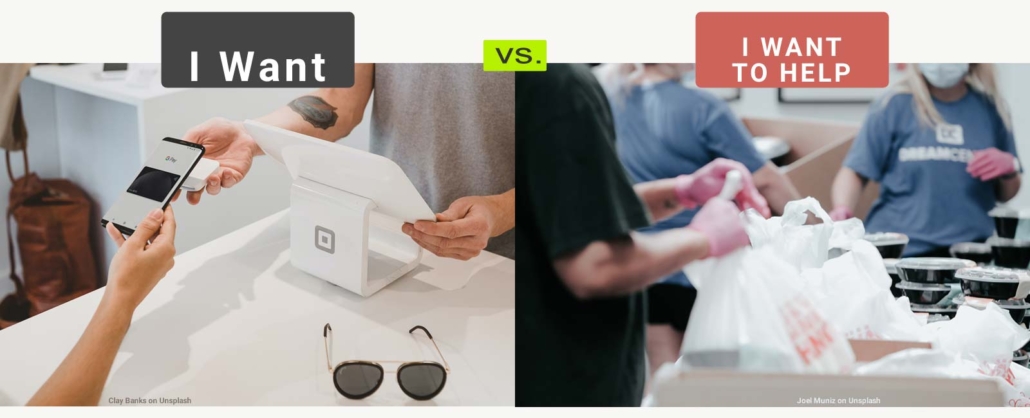
The for-profit website targets the product buyer—who is almost always (save for gift cards) the product’s end-user. So when creating your website for the commercial sector, you are communicating to one audience: the buyer/user.
The nonprofit website, however, generally addresses two audiences—often split equally. One message is for the product buyer (the donor of the product or service), and the other is for the product end user (the people in need of the product or service—the client). And this sort of split-branding can be a challenge.
In both instances, the product needs to be well promoted as necessary to the buyer and of good value—be it a widget for oneself or a critical service to another. For the for-profit, this singular focus makes creating the web presence relatively streamlined.
But what about the nonprofit’s end user—the client? Their user experience will not be buyer’s satisfaction or even return on social investment (ROsI), but on when, where, and how to obtain the product/service and how quickly they can access it. (This client priority, by the way, is also essential to the buyer/funder who considers the overall user experience for clients as a reasonable ROsI.)
ROsI
The ROsI continues beyond the product/service level for the funder or even how well the website offers equal space for donors and clients. The funder tends to look at multiple factors:
- Desktop/laptop viewing first: Can they view the website well on their desktop/laptop as well as a mobile device? (Since donors tend to use desktops/laptops more than mobile devices when considering their involvement in an organization, good content is vital.)
- Is the website engaging without a look of wastefulness? I.E., not too flashy and overly trendy, yet engaging?
- How are the clients (recipients of their intended support) perceived? Will particular content direction (images and descriptions) turn off the donor—or, perhaps, the client? (Too often the pitch to the donor depicts the worst-case scenario.) When it comes to content development, it is almost always better to address the client with optimism and without judgment.
- What are the calls to action other than donation requests? Sign-up forms or event invitations allow the donor to feel like a more significant part of the organization’s community than just another income stream. Volunteering opportunities can cement involvement.
- How has the website prioritized its giving, be it donations or volunteering time?
Access
As for the client, their priorities may be:
- Mobile device-friendly first: Is the website conforming well to handheld devices (is it “responsive”)? According to a Pew study, 50-75% of homeless and low-income people only have access to a mobile device, be it a smartphone or tablet. Considering this, the website should be designed with a desktop in mind for the donors and in responsive format for clients—which requires a judicial approach to paring down content, along with format tweaks, for the best view on mobile devices.
- How intuitive is it to locate the product/service? Are dates and times clearly stated? Are schedules, directions, and maps provided?
- What are the limitations and “need to know” messages?
Unique Content for the Nonprofit
There are pages and applications that are geared more toward the nonprofit than the for-profit:
- Client programs/services
- HIPPA or other statements of privacy
- Financial disclosure
- Volunteer program and forms
- Board of directors page
- Access to departmental staff
- Robust About Us / History page(s)
- Achievements and profiles
- Membership/subscription
- Dynamic social networking center-point
- Calendar
- Donation options page (from one-time donations to planned/estate giving)
- A very user-friendly “back end” so that in-house staff can make updates and new pages without needing a dedicated webmaster.
In a nutshell, the user experience differs between nonprofit and for-profit websites, and we get that. Dot Org Web Works stand out from other website developers because we only work for the charitable nonprofit sector.
This article was originally published on May 5, 2018. Last update: May 29, 2023
We would LOVE (that’s no exaggeration!) to work with you on your next (or first ever!) website. And if you think that having professional assistance may be outside of your current budget, you may be in for a pleasant surprise.

